In the framework of the Public Tender for the Establishment or Upgrade of E-business in SMEs in the Period 2017-2018, “E-business 2017-2018”, we decided on a systematic approach to the realization of the tender, and, based on a study of digital presence on foreign markets, we developed a marketing strategy for Kopit.
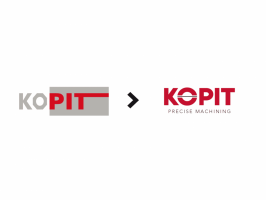
We decided to renew the comprehensive graphic image as a whole and thus, in cooperation with experts, came up with a new recognizable logo and companyslogan.

The creative starting point of the logo was the preservation of the existing recognizable colors of red and gray, and the upgrading in line with the accepted slogan “Precise Machining”. In addition to the red / gray color combination, the distinctive element became the letter “O”, or the circle, as a metaphor for the pipe, with a thin line embedded into it. The combination of these elements symbolizes precision, accuracy and focus.
The objective of applying for a public tender was to improve the company’s opportunities in expanding its operations in foreign markets, thus increasing our international visibility and competitiveness.


